Ilga often gets comments from customers about how the colors of the fibers look JUST LIKE THE PICTURES. This is not an accident. Ilga takes every image into Photoshop and plays with it until it is as close to the original as she can make it. Another thing, be sure your monitor is color calibrated (check the manual to see how). Whether you use Photoshop or another photo manipulation program isn’t important. Whether your picture is for Ravelry, sending to your great-aunt, or just for your records, color accuracy is important.
Here is a series of three pictures adjusting a photo. If in doubt, practice with having flesh tones in the picture.
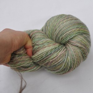
- Photo directly from camera
The first picture is right out of the camera. Telltale signs that something is wrong are the murky whites, the dull contrast in the yarn and that bright pink thumb.
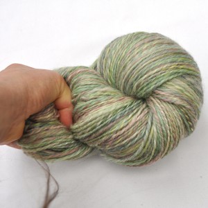
- Photo after white balancing
The second picture is after white levels are adjusted. The white is brighter, but still a little pink, the colors in the yarn are perkier, but that thumb is still a problem.
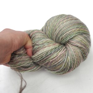
In the third picture, the magenta and cyan color ranges are adjusted down. Now the white background is less pink (and so is the thumb) and the yarn doesn’t look as yellowed.
This is not CHEATING, this is making sure that the colors of your picture actually match the real world a little better.
Other tips: Get to know your camera. Ilga IS NOT a camera whiz/geek/whatever…this is more about being observant. (Some cameras allow you to adjust greys against a known (read: you need to buy it) grey card. There are little idiosyncrasies of your camera and light which you can learn. Ilga’s camera LOVES greens, is very good with blues (it’s digital, film cameras HATE blues), and is a little too rambunctious with reds.
Notice which times of day are best for making the most accurate pictures. NEVER take your pictures in direct bright sunlight. Keep your backgrounds simple.


